Jeroen ten Berge

Coming Soon: THE ARM OF DARKNESS

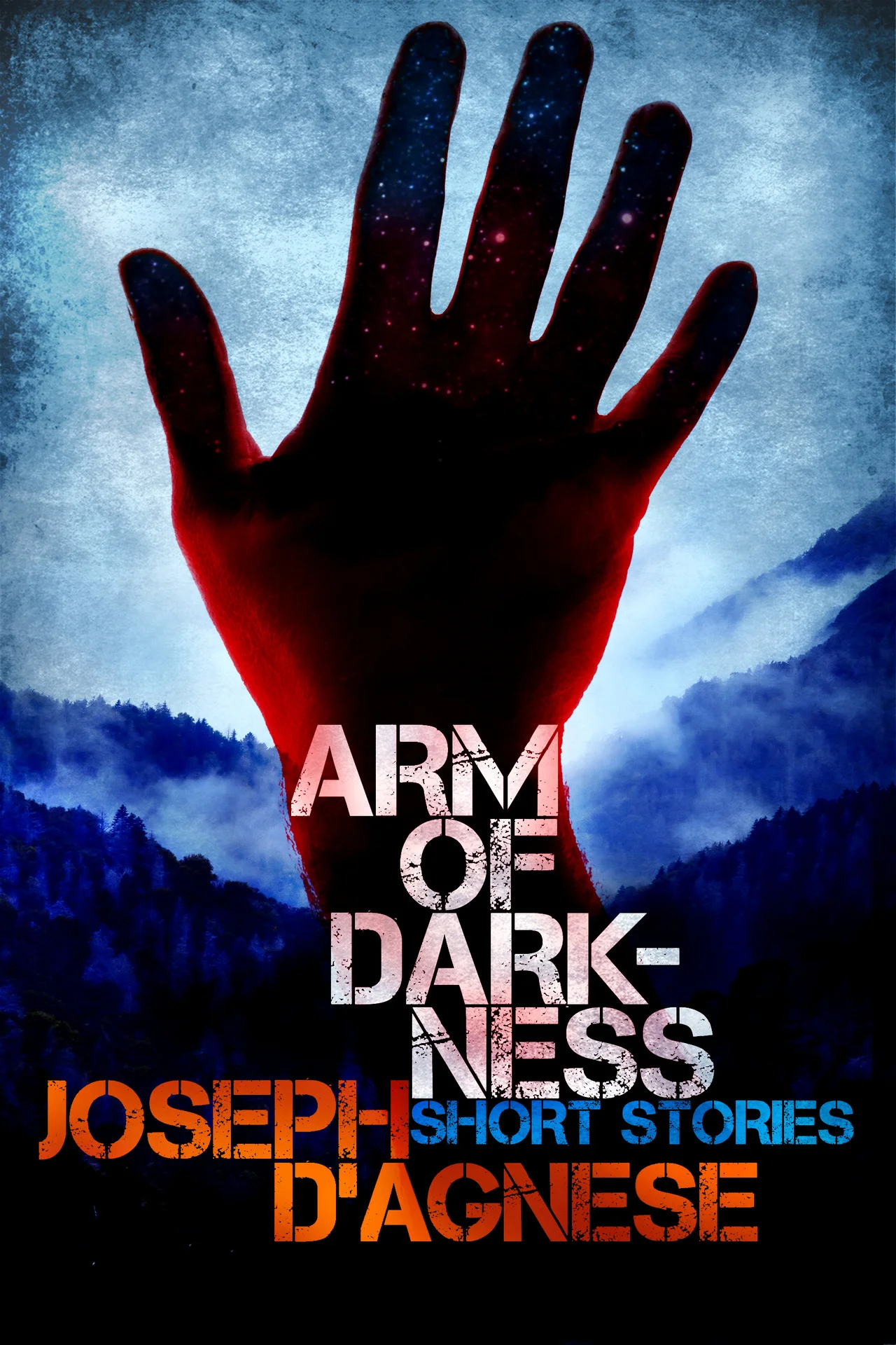
Here’s the cover of one of my next books. Hope to get it out in the next few weeks.It’s your basic short story horror collection—with a touch of crime fiction, sci-fi, ghosts and cryptozoology. As always, if anyone would like to review the book, con…

Here’s the cover of one of my next books. Hope to get it out in the next few weeks.

It’s your basic short story horror collection—with a touch of crime fiction, sci-fi, ghosts and cryptozoology. As always, if anyone would like to review the book, contact me and I’ll send you a free copy when I’m ready to release it. I don’t ask for anything more than an honest review.

I talked more about the book in this post.

Here’s the pitch:

***

His hand is fashioned from the night sky.

It is powerful, dark, deadly.

He dwells in the world’s oldest mountains and always comes bearing gifts.

Truth is, he cares nothing for you. He is a trickster, a prankster, a demonic being who desires only to wreak casual violence on every human he meets.

He’s about to offer you a bargain.

Don’t trust him.

* * *

ARM OF DARKNESS contains six short stories from the author of The Mesmerist, for a total of 30,000 words.

* Skullworm

* Roadhouse

* Glow

* Kin

* Sunshine lady


And the origin story:

* Arm of Darkness


Cover by Jeroen ten Berge

The Mesmerist is live! (Sort of.)

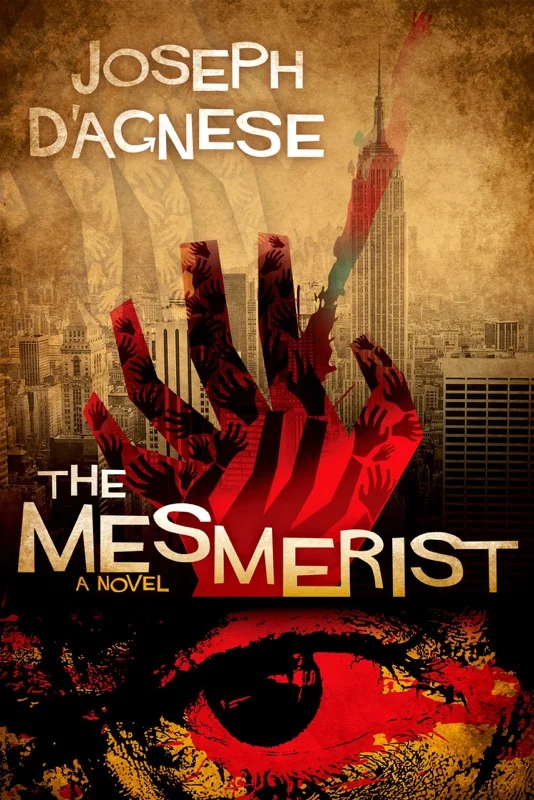
The Mesmerist by Joseph D'Agnese

My new e-book, The Mesmerist, is live on Amazon. It’s been published to B&N and Smashwords as well, but will take a while to filter through to those stores. 

Both of my novels could use some reviews, so I’m making a limited-time offer: If you’d like a free copy of either Jersey Heat or The Mesmerist in exchange for your honest review on Amazon and Goodreads, kindly contact me via my contact page and I’ll send you a file for your device. If you want to participate but don’t “do” devices, write me anyway and I’ll hook you with a tidy PDF version. (Paperbacks coming soon; I promise.) And no, I’m not afraid that you might hate the books. I need reviews of all kinds, good and bad.

Here’s the pitch:

Are you a think—or an unthink?

On the streets of New York City in the 1970s, this is the only question that matters.

In the age of disco, the city has become home to an underground culture of gifted individuals who can kill with a glance or heal with a touch.

A vicious madman is sucking the life out of his victims—crushing their hearts, withering their bodies, and leaving their corpses old before their time.

All with the power of his mind.

Now a skeptical young cop and a federal agent obsessed with the occult must run the killer to ground before they find themselves facing the unthinkable.

An 85,000-word urban fantasy noir by the author of the eco-thriller, Jersey Heat.

This full-length novel is intended for mature audiences.

If you’re looking for more discussion on this, I can tell you that the book is set in New York, 1979, which was an interesting time in the city’s history. It’s the age of disco, the age of the city’s most famous serial killer (Son of Sam), and the time of America’s first great oil crisis. (A gallon of gasoline hit $1 for the first time that year, which had devastating knock-on affects for the American psyche.) 

New York City was in a fiscal nightmare. Trash littered the streets; graffiti was rampant. Most of the parks New Yorkers treasure today crawled with drug dealers. The city was a crime-ridden dump because the middle class was fleeing the island for the suburbs, taking their tax dollars with them. The disaster of America’s involvement in Vietnam had wrapped up in 1975, but the effects of that war were still impacting the nation’s politics. Nixon was out of office, and Americans had elected a mild-mannered peanut farmer, Jimmy Carter, as their president.

And yet, at the same time, it was a time of great flowering for artists such as Warhol, Hockney, and Serra. Gehry and Pei were designing some of their greatest architecture, and the World Trade Center was nearing completion in lower Manhattan. Part of the novel touches on the art scene of the time.

And I intend to follow up this book with two others in a trilogy, featuring the book’s two occult detectives, Soul and Fisher.

As Fisher and Soul try to track their killer, they’re forced to make sense of the killer’s powers by researching books on psychic phenomenon. So there’s kind of a bizarre paper chase going on in the plot.

When I was a child my father was obsessed with psychic phenomenon, and I suppose I absorbed this stuff by osmosis. He devoured old books about men like Emile Coue, the father of autosuggestion; Edgar Cayce, a psychic who claimed to “read” books by sleeping on them; Edmund Shaftesbury, a quack and charlatan who tried to teach people the power of “personal magnetism”; and Thomson Jay Hudson, a skeptic who tried to make sense of these bullshit claims. 

In my book, of course, all this stuff is treated as if it is true. Fisher, the cop, is the skeptic; Soul, the FBI man, is a believer.

You can page through Hudson’s book here, and see some of those old-fashioned print block designs they used in books of that period, if that interests you…
Sample page 1

Sample page 2

Sample page 3

I hope this is a good introduction to the concepts of this book. I’ll be back in a few day or so to talk about the art world connections.

Oh—in the time it took me to write this post, I sold a copy on Smashwords. Yay.


Yes, I am trying to post here more often. Thank you for noticing. If you want to sign up for my newsletter and claim your collection of free ebooks, go here. Thanks!

Coming Soon: The Mesmerist

The Mesmerist by Joseph D'Agnese

The Mesmerist is an urban fantasy noir novel that I’ll be releasing this month. The story is set in an alt-version of 1979 New York City, in an era when looks can kill and hands can heal. 

I’ll be posting some more details as they’re ready.

I bow, as always, to the incredible talent of book cover designer, Jeroen ten Berge.


Yes, I am trying to post here more often. Thank you for noticing. If you want to sign up for my newsletter and claim your collection of free ebooks, go here. Thanks!

Cover Story: Night Market

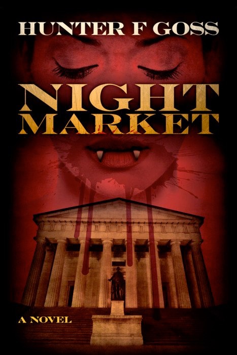
Night Market by Hunter F. Goss

The images behind any book appear first in the author’s mind. What do my main characters look like? How do I envision their homes, their world, their nightmares? 

A writer can go weeks, months, or years carrying these visual images in his or her mind. 

Then the cover artist appears on the scene, and pits his vision against the author’s, striving to create a look that will be highly compelling and marketable. In this occasional series, we’ll look at both sides of the development of an ebook cover. Who was thinking what — and when? Which came first, the author’s concept, or the designer’s?

Today we’re joined by Hunter F. Goss, author of Night Market, and cover designer, Jeroen ten Berge.

Night Market intrigues me because I’m a sucker for novels and thrillers that incorporate historical figures. I loved books such as E.L. Doctorow’s Ragtime, Caleb Carr’s The Alienist, both of which feature appearances by the financier J.P. Morgan. As far as I can recall, Morgan does not appear in T. Coraghessan Boyle’s The Road to Wellville, but that book’s fixation on food reminded me of some of the over-the-top dining scenes in Night Market. The nonfiction book Appetite City, by William Grimes, about the culinary world of old New York, also conjures up for me the feeling of sumptuous dining in Goss’s fin de siècle world, minus the vampires, of course. Let’s get to the interview.

What is your book about?

Goss: Night Market tells how and why the Undead helped the American financier John Pierpont Morgan rescue some of America’s largest banks during the Panic of 1907.

How did you pick your cover artist?

Goss: I looked at a lot of cover artists who were doing work for indie authors, but Jeroen ten Berge’s work stood out far and above the crowd. When I saw Jeroen’s cover for Steve Richer’s The Gilded Treachery, I knew he could connect with the sort of “what if” historical novel I’d written.  

What instructions did you give him?

Goss: We exchanged a few emails, and Jeroen told me how he works. When I sent him a synopsis and manuscript to work with, I told him about two images I kept getting in my head. One was a kind of Wall Street Journal look, but we knew Mr. Murdoch wouldn’t be amused by this. The second image was that of a female vampire against some sort of Wall Street backdrop. I originally saw her as having her fangs bared and ticker tape for a tongue, but Jeroen didn’t think it fit with the book’s premise. He was right. After that, I just let him alone to do his work and the result is what we see here.

What did you like about the cover he created?

I really liked the central elements Jeroen chose to focus on: Veronica Fontera, one of my two protagonists, and a recognizable Wall Street landmark. That landmark is Federal Hall, which at the time Night Market takes place was being used as a gold depository called the Sub-Treasury. At the very beginning of the story, the Sub-Treasury’s reserves were being depleted by Europeans cashing in government bonds for gold. It was called the Gold Crisis, and the solution to it is what brings my other protagonist, Andrew Kirkland, and Veronica together. 

Jeroen reinforced the idea of money and finance by using a font reminiscent of what we see on United States currency. He uses a serene image of Veronica with a splash of blood at her mouth that’s dripping down over the Sub-Treasury building, suggesting violence and the paradox she represents. The image is completed by the use of varying shades of red, playing up the gothic suspense elements of Night Market. All told, I’d say Jeroen hit the bull’s eye.  

What reaction, if any, have you gotten about the cover?

Goss: Really positive. I actually showed it to two stockbrokers, who immediately “got” what the story is about just by looking at the cover. And that’s what any writer needs in order to sell a book. When my editor saw it, she was blown away. Then she told me we were going over the manuscript one more time. “One more time,” though, ended up being eight weeks before she said, “OK — publish it now.”

Can you tell us anything about yourself, particularly how amassed the knowledge of 19th and early 20th century economics to be able to pull off this book?

Goss: I grew up around the hide and leather business, and except for a couple of years in academia after graduation doing economic research, that’s where I spent most of my working life. I call it the most obscure and unglamorous corner of the fashion industry, but it gave me an opportunity to travel to a lot of places that end up appearing in my stories. Paris was one of those places, and some important scenes in Night Market are set there.

I left the business a few years ago when just too many of our customers decided it was a great idea to manufacture in low-wage countries. It didn’t pay to keep the operation going, and it wasn’t really fun anymore, so I got serious about the only other thing I’ve ever wanted to do: writing. 

Besides papers for academic journals, some wine articles, and promotional material for leathers used at trade fairs, I’ve done some comic and graphic novel work for the European market under another name.

I live and hang out in the Rust Belt along the Pennsylvania-Ohio border. Pittsburgh is in one direction and Youngstown, Ohio is in the other. 

Okay, so let’s switch over to Jeroen. What challenges did you face creating this cover?

ten Berge: I was immediately intrigued by the story, the fact that it mixes historical fact and characters with fictional ones, setting a stage for something that might actually be true. (Well, we now all accept Wall Street is rife with vampires, so it must be true!) Alternate history fiction, or “What if” fiction as Hunter calls it, has always fascinated me. Robert Harris’ Fatherland, which offers a scenario of Germany winning WWII with Hitler still ruling when the Beatles consider touring Berlin, is a prime example of the genre. One of my favorite books in the genre is Resurrection Day, by Brendan DuBois, set in the 1970s, after the Cuban Missile Crisis escalates to a full scale war, devastating Russia and leaving the United States reliant on aid from Great Britain. Both are fantastic reads and come highly recommended. But I digress.

The challenge for me was finding imagery that conveyed the story. I had the elements for the design in my head quite early on. Initially I looked for historical images of New York City and Wall Street, but aside from a few dainty old photographs there was nothing I could use. Then I stumbled on a current photo of Federal Hall I could potentially use. I photoshopped out modern-day trash, street lights, and a railing, to give it a sense of it being 1907. Veronica’s image was easier, as I used my wife for a model, bar the teeth. When I had those two key elements, the rest was pretty straightforward. I added fangs, blood, and text and then played around finding the best composition, most suitable typeface and a striking color scheme. 

* * *

That’s it, folks. Night Market is available via Amazon and Smashwords. Thanks to Hunter and Jeroen for participating in this inaugural post on ebook covers.

Note: Both of my ebooks, designed by Jeroen, are on sale through the holidays for $0.99.


Yes, I am trying to post here more often. Thank you for noticing. If you want to sign up for my newsletter and claim your collection of free ebooks, go here. Thanks!

Paging Mr. Rash

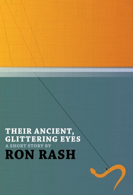
My interview with Jeroen ten Berge, a Dutch-born designer who lives and works in New Zealand, brought to light a startling coincidence yesterday. It seems that Jeroen greatly admires author Ron Rash, a noted author who writes books based in Appalachia, where Rash’s family has lived for generations.

This surprised and delighted me, because I happen to live smack dab in the middle of Appalachia, in Asheville, NC, where Mr. Rash is regarded not only as a literary giant but is also likely to be hailed on the street with an effusive, “Hey, Ron, how’s it going?” (He’s also a professor at nearby Western Carolina University.)

Portrait of Jeroen ten Berge

It gets more interesting, and beautiful, depending on your perspective. Here’s what Jeroen had to say about one of his favorite authors: 

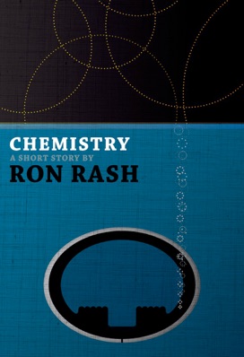
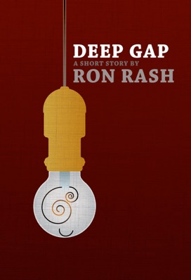
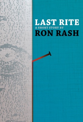
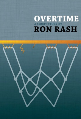
“One of my favourite authors is Ron Rash, who writes amazing stories set in the Appalachians. I love his style, the dire realism of his work, the love he has for nature and how he describes his characters, their relationships, the choices they make and how it affects them. I’ve read all his work except for Serena, of which I read the first two chapters only. I’m saving the rest for the perfect moment, whenever that may be. For my own pleasure I designed nine covers last year, for some of his short stories. After awhile I found the courage to send them to him, hoping I could sway him to publish his work as eBooks, featuring my covers. He said he found the illustrations wonderful, and referred me to his agent. Sadly it ended there. Rash did give me permission to show the covers on my website — haven’t done so yet.”

Jeroen shared the covers with me, and I’m posting them here, as sort of a testament to one artist’s love for a fellow artist’s work.

Since I’m anticipating some readers of this blog will be interested in buying Rash’s books, I suggest they visit the website of Asheville’s local bookstore, Malaprop’s, where buyers have the highest probability of finding autographed copies of Mr. Rash’s books. 

If you do call, tell ‘em you heard this charming story, and who knows? Maybe someday Jeroen will be designing those covers for real.


Yes, I am trying to post here more often. Thank you for noticing. If you want to sign up for my newsletter and claim your collection of free ebooks, go here. Thanks!

Q&A: Jeroen ten Berge

“The cover of your book looks amazing!” people tell me. And I absolutely agree. The compliments I’ve been hearing lately refer to the two books I recently published. The striking covers were designed by the talented Jeroen ten Berge, a Dutch-born designer who lives and works in New Zealand.

Portrait of Jeroen ten Berge

Lately, every time I read about a hot new indie title—whether self-published by a name author or an up-and-coming newbie—the man behind the cover art is Jeroen.

I’ve been obsessed with illustration since I was a kid. In my career, I’ve been lucky to work with children’s book illustrators and magazine illustrators, but this is the first time I’ve personally hired and teamed up with a cover artist to bring my work to life. I thought I’d take some time to ask Jeroen all the little questions I’ve been shy about asking during the few months we’ve been working together.

He graciously consented. Here’s our interview, along with links to some recent cover art by the man himself.

How do you describe the work you do? Are you a designer, an illustrator, or what? (It might help if you tell us what your training/background is.)

I consider myself a designer first. However, illustration is a skill I almost always use to assist me in creating the design I have in mind. In some cases an illustration becomes the key element of a design. Your book The Scientist & The Sociopath is an example, but the Serial-series covers I created for Blake Crouch and Joe Konrath are also illustrations, as is Suzanne Tyrpak’s Vestal Virgin cover. I also use stock photography, sometimes my own. Several of the covers I designed for Marcus Sakey feature my photos, as do several of Blake’s covers. 

I guess I was fortunate to have studied graphic and typographic design at the Royal Academy of Arts in The Hague in the early- to mid-1980s. There was a strong focus on teaching the principles of design and typography, taught by people such as Gerrit Noordzij, one of the greatest type designers of his generation. There was, however, equal attention paid to illustration and photography. The philosophy was very much, "Why ask someone else to make an illustration or photograph for your design if you can do it yourself?"  In retrospect I can see that graduating the year before Apple MacIntosh was introduced to the Netherlands helped as well. Knowing how lead type works, and why there are certain rules of design helps me on a daily basis. That said, I have worked on an Apple for more than 20 years now, and would consider a career change if I had to go back designing old school.

Everywhere I look these days, I see your name and your work. I unhesitatingly tell people that you are probably the best designer of indie book covers on the planet. Do you have any problem with that designation?

If that is your truth — so be it, I’m flattered. However, I’m sure there will be many people who beg to differ, who prefer someone else’s work. I would never use the designation myself, or even consider the thought. Like most people working in the arts, everything I do is accompanied with doubt. Is it good or is it crap? Will the client like the cover, or think it is shit?

What other types of design work do you do and how important is the indie book business to your overall workload?

Before entering the book design world about three or four years ago, I designed logos, corporate identities, websites, wayfinding, and packaging. I still do, but designing covers has become something I’m very passionate about. It is hard to say what the balance is today. A year ago I would have said 80/20 in favour of the other stuff. Today it is probably 40/60 in favour of book covers. Who knows what it’ll be next year?

About how many covers do you create a year? Is that part of your business growing?

I don’t know — I haven’t counted. I can tell you that about a year ago I worked with about 7 or 8 authors, today it is over 40. So yes, that part of my business is growing.

Soup to nuts, how does a cover come to be? How long does the process take, and do the steps you take vary from cover to cover?

It depends. I usually receive a manuscript, sometimes accompanied by a synopsis. I read it, take in account additional information offered by the author and I think. And think, and doodle. And sometimes research. I think until I have an idea, or several, then edit, and usually only then start to actually design. Almost always I create one cover and present that to the author. I don’t do comps and send a bunch of ideas to the author. It creates confusion. It does, however, mean that I occasionally present a design that doesn’t work for the author. Which means that I then go back and present a new and different idea, taking in account the author’s feedback. Important to me is that the author receives a cover he or she feels completely happy with, and is proud to share with his or her audience.

What kind of software or other tools do you use to make a cover come to life?

Illustrator, Photoshop, and Indesign are my software, plus the thousands of typefaces I have bought over the past decades. My hardware are a MacBook Pro, two iMacs, and my beloved MontBlanc Meisterstück (which I bought twenty years ago as retail therapy after a particularly frustrating meeting with a client) for writing notes. I also use Steadtler Ergosoft and Omnichrom 108-3 Aquarell pencils for doodling and sketching in Moleskine drawing notebooks. I’m a sucker for nice stuff.

You told me once how ideas for covers pop into your head as a quick flash of insight or inspiration. Can you tell us what that process is like?

Annoying — because it never stops. I sometimes even design in my dreams. I’m not kidding. It is bloody annoying, especially for family and friends. We can have a lively conversation, and I see or hear or smell something that triggers a synapse in my brain and off it goes. I have to leave the party to write the idea down, or make a quick sketch, otherwise I might forget it. It drove my wife bonkers, but she’s used to it now.

Do you read all the books for which you design, or is it enough to simply get a feel for the concept from the author?

I read almost all the books I design covers for, or at least enough to get a feel for the story, its tone and style. Occasionally the author supplies a summary or synopsis of the book, which allows me to skip reading the book itself. I’ve probably read over 80 novels so far this year. I’m not a fast reader, so reading is expensive. Thankfully sometimes an idea can be triggered by a paragraph in the author’s email, talking about the manuscript. Then I only read enough to confirm my idea truly fits. 

It seems like you do mostly mystery, thriller, horror book covers. Are these your favorite genres?

Not necessarily. It is the quality of the writing, combined with great storytelling that makes me tick. One of my favourite authors is Ron Rash, who writes amazing stories set in the Appalachians. I love his style, the dire realism of his work, the love he has for nature and how he describes his characters, their relationships, the choices they make and how it affects them. I’ve read all his work except for Serena, of which I read the first two chapters only. I’m saving the rest for the perfect moment, whenever that may be. For my own pleasure I designed nine covers last year, for some of his short stories. After awhile I found the courage to send them to him, hoping I could sway him to publish his work as ebooks, featuring my covers. He said he found the illustrations wonderful, and referred me to his agent. Sadly it ended there. Rash did give me permission to show the covers on my website — I haven’t done so yet.

So are we unlikely to see a cover by you for a sci-fi or fantasy ebook featuring some kind of Hobbit-like creature in the near future?

I usually say I won’t design covers for books that are about scarcely clad guys toting oversized shining swords conversing with dragons — not my cup of tea. That said, someone I already work with sent me the first snippet of a novel that is very much fantasy, and immediately the ideas started bouncing. So watch this space…

We first met when I asked you to do a cover for my nonfiction science book. You said you were intrigued because you actually have an interest in all kinds of nonfiction books as well. Can you tell us about some of your recent favorite NF reads? 

I’ve always been interested in human behaviour. What is it that makes us do what we do, and why? Do we have any control over our destiny, is there such a thing as fate? Why do people fall under the spell of others — and would I? Right now I’m trying to read The Black Swan, by Nassim Nicholas Taleb, which is about unpredictable and improbable events, and once they have happened how we then try to explain it, rationalize it, attempting to make it appear less random, more predictable. Which Taleb explains is pointless, I think. Another one is Hitch 22, Christopher Hitchins’ autobiography. But I’m afraid both are too demanding right now. I guess I should book myself some long flights for those two books.

What also interests me greatly is how talented people utilise their artistic creativity to con people. Especially where it concerns the fine art scene. One of my favourite non-fiction books is Clifford Irving’s FAKE! The story of Elmyr De Hory, The Greatest Art-Forger of Our Time, published in 1969. Anyone remotely interested in fine art, the art of collecting fine art, and the gullibility and greed of people should read it. Also fantastic, and more recent, is Freakonomics: A Rogue Economist Explores the Hidden Side of Everything, by Steven Levitt and Stephen J. Dubner. 

Can you name some up-and-coming self-pubbed authors whom you think have great promise?

I think Blake Crouch will become one of the greatest thriller writers of his generation, if he isn’t already. J.E. Medrick has the potential to become a household name — her Icarus Helix series totally rocks. Roy Finch’s The Emperor of Glitter Gulch is an amazing and brutal debut. Steven Konkoly’s The Jakarta Pandemic, if you like a terrific novel about society unraveling after an event; Suzanne Tyrpak’s Vestal Virgin, if you are into the genre currently dominated by Robert Harris. Ania Ahlborn’s debut Seed is a terrific horror yarn, as is Robert Swartwood’s The Dishonored Dead, but for totally different reason — best zombie book I have ever read. And Saffina DesforgesSugar & Spice will more than satisfy anyone who loves a psycho-sexual thriller. There are more – should I continue?

Are you pleased with your increasing work in book covers? Is there ever such a thing as too much work for a freelancer?

Yes, I am — very much so. With designing ebook and print-on-demand covers I have found something that combines my love for reading, collecting books, and design. I have never been very ambitious, but having found this niche — and enjoying it immensely, I now want to build a large and diverse body of work. This is only the beginning.

What the heck are you doing living in New Zealand, and can you get us all a good deal on some sauvignon blanc?

That is a very long story I may tell you in person someday, while enjoying a bottle of that great sauvignon blanc or pinot noir growing in my back yard.

Thank you, very much, Jeroen, and here's hoping we'll meet in person someday.


Yes, I am trying to post here more often. Thank you for noticing. If you want to sign up for my newsletter and claim your collection of free ebooks, go here. Thanks!